Be sure to adjust your screen so it is wide enough to see both ends of this line:
If you properly calibrate your monitor, you will see this page as it was written and enjoy many other pages on the GEMMOLOGY WORLD website.
This colourful bar should be a graduated rainbow with red at both ends.
Look for a smooth transition between colours with no banding or annoying dots.
The image below does not have smooth gradations. This is the type image you see with limited monitor colours.
Or, you might see banding, like this.
Now that you see how your colours should appear, we will look at gamma and contrast.
Below are four boxes. One is totally black. Nothing on your monitor should be as dark as that black box except the black area around your screen. And nothing should be any lighter than the white box. There should be no colour tints in either the gray or white boxes.

Above is a 10-section step-wedge that shows you if you have a full chromatic scale available on your monitor. You should see 10 separate tones or steps between white and black.
Step back from your monitor and squint your eyes. One of the gray areas inside a numbered box should be near the same shade as the surrounding checked area.
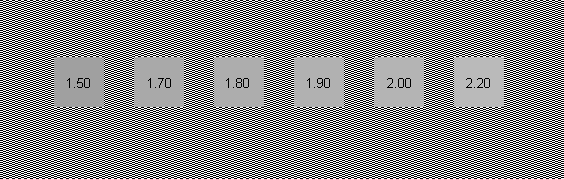
That is your screen gamma. Most computer monitors are designed for 1.8.